
HORIZON ESTATES
Horizon Estates is a modern real estate brand built around trust, ambition, and the pursuit of what lies ahead. The brand represents more than property transactions. It represents new beginnings, elevated living, and the opportunities that come with finding the right place to call home.
MAIN LOGO
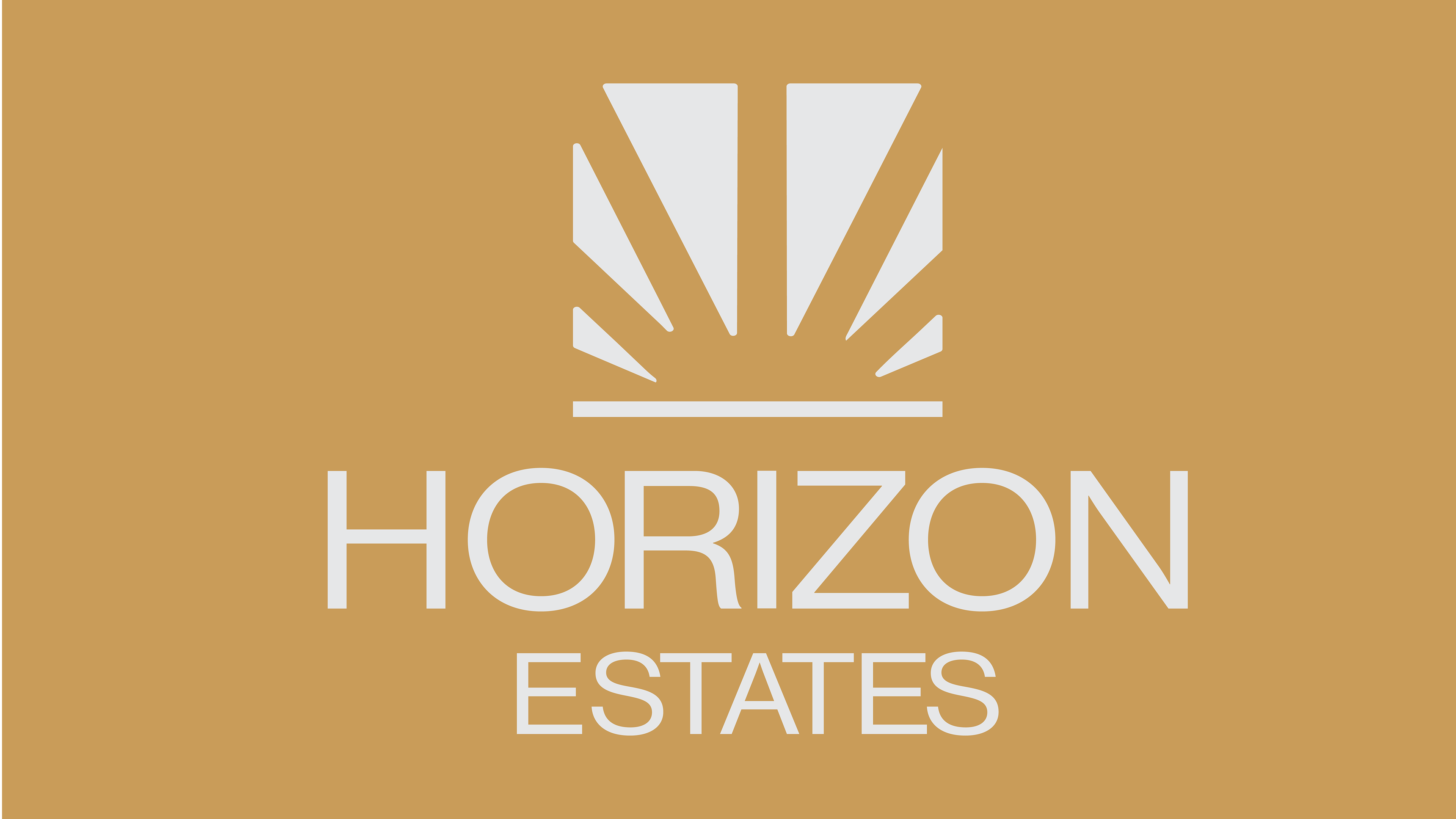
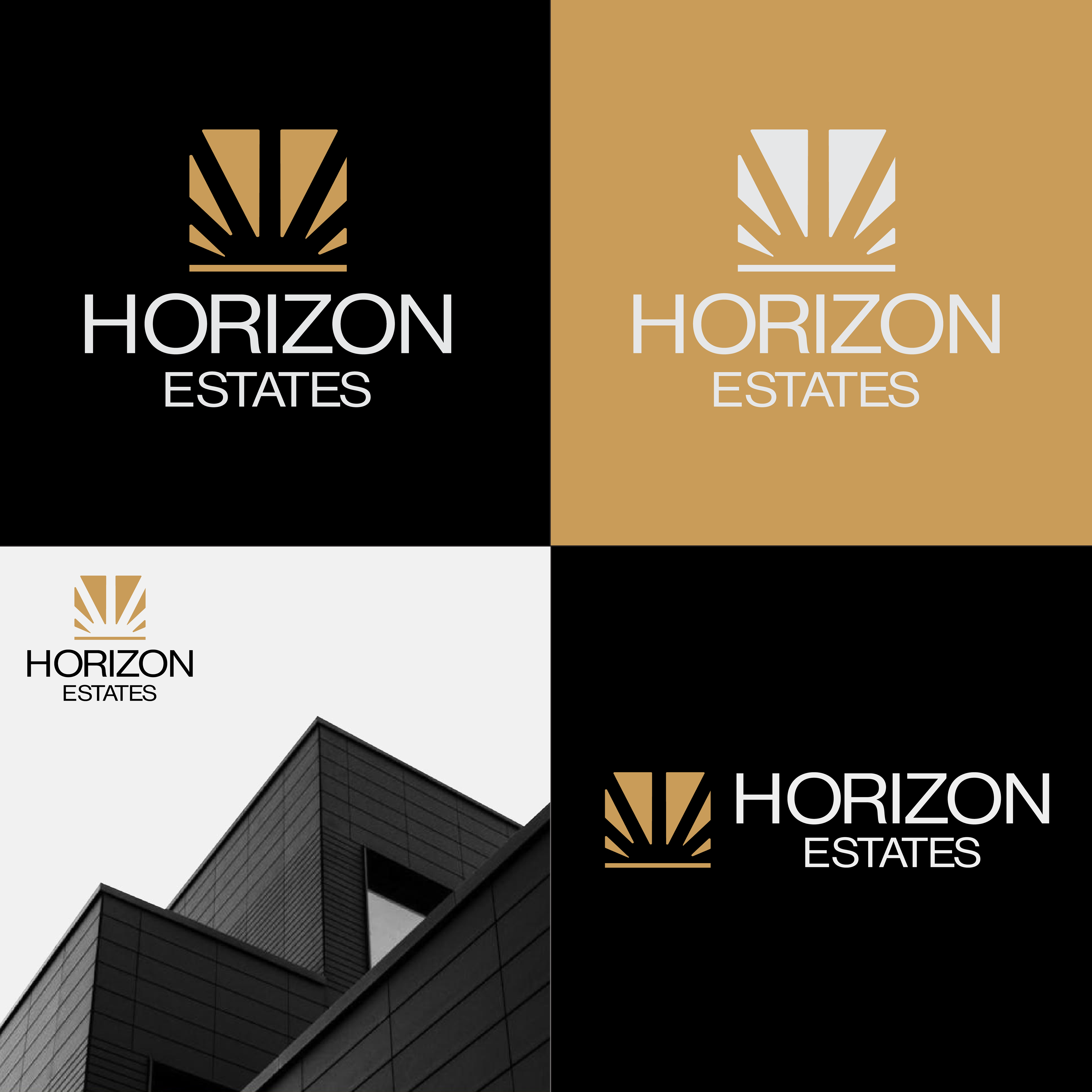
The Horizon Estates logo combines a rising horizon/sun with a refined, geometric wordmark. The symbol represents the moment when the sun rises above the horizon which is a visual metaphor for new beginnings, opportunity, growth, and looking toward the future.
THE LOGOMARK
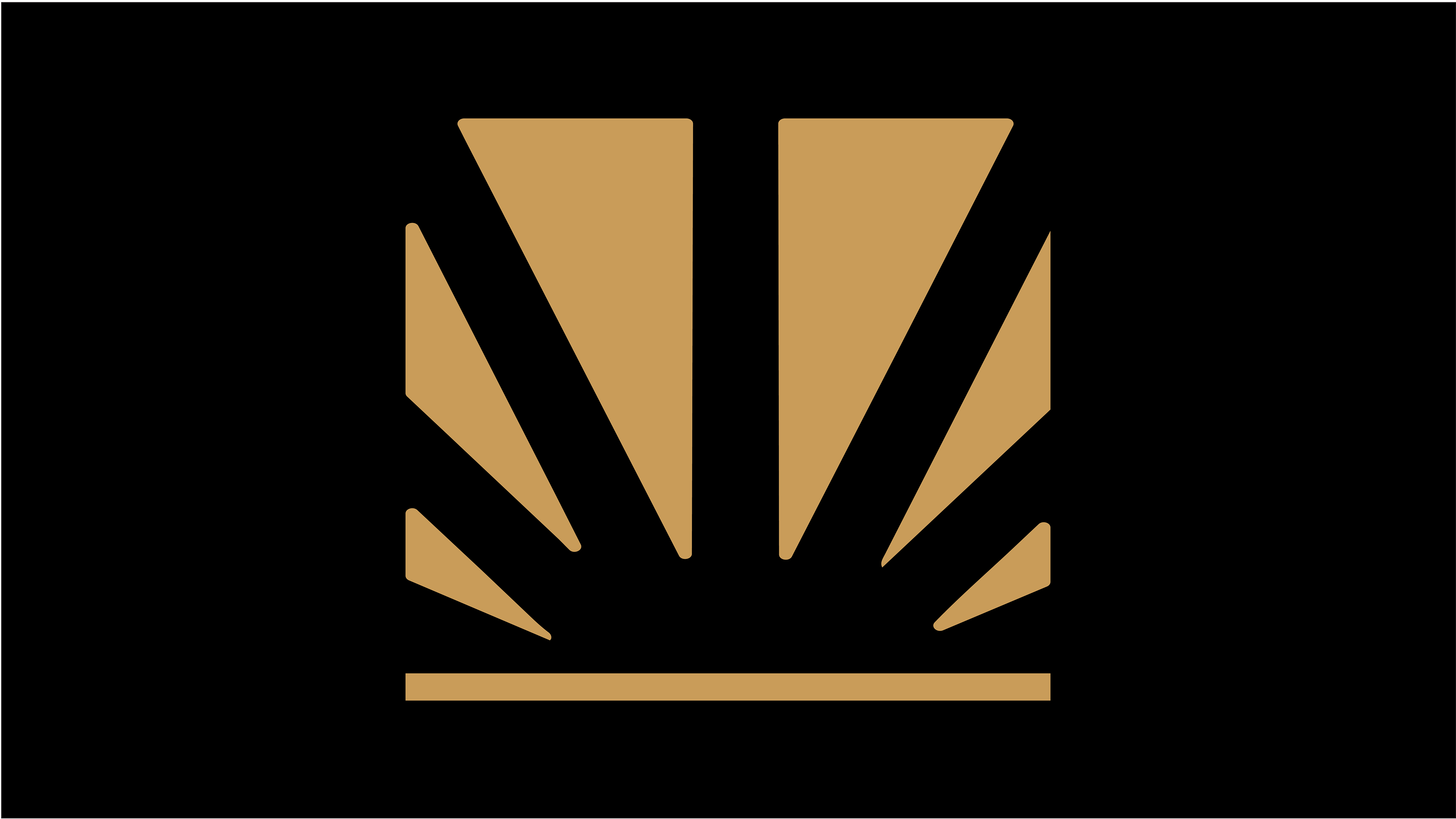
01 — THE SUNThe central form represents the rising sun.
It symbolizes: New beginnings,Opportunity,Growth,Optimism, A brighter future.
02 — THE RAYS
The surrounding geometric rays create a sense of movement and expansion. They suggest opportunities radiating outward from a central point.
03 — THE HORIZON
The horizontal line anchors the symbol. It represents the horizon itself.
THE WORDMARK
HORIZON uses a clean, contemporary geometric treatment to establish a sense of modernity and confidence.ESTATES sits beneath it at a smaller scale, creating hierarchy and reinforcing the real-estate category.
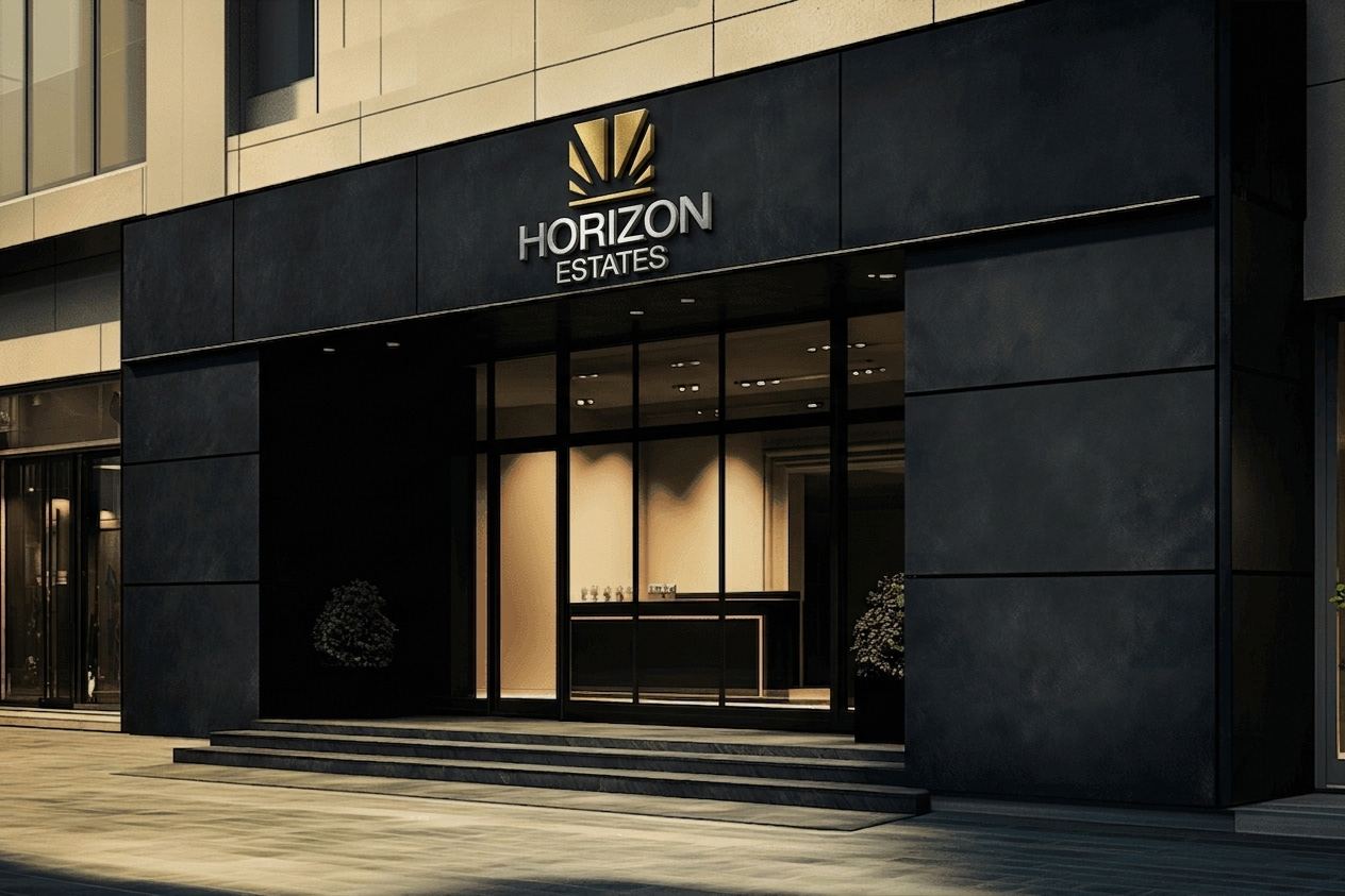
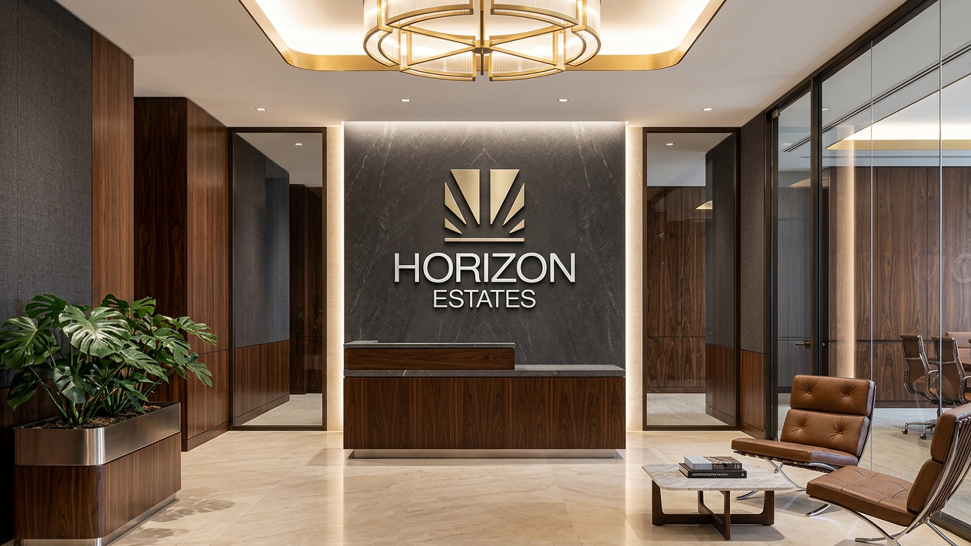
LOGO APPLICATIONS
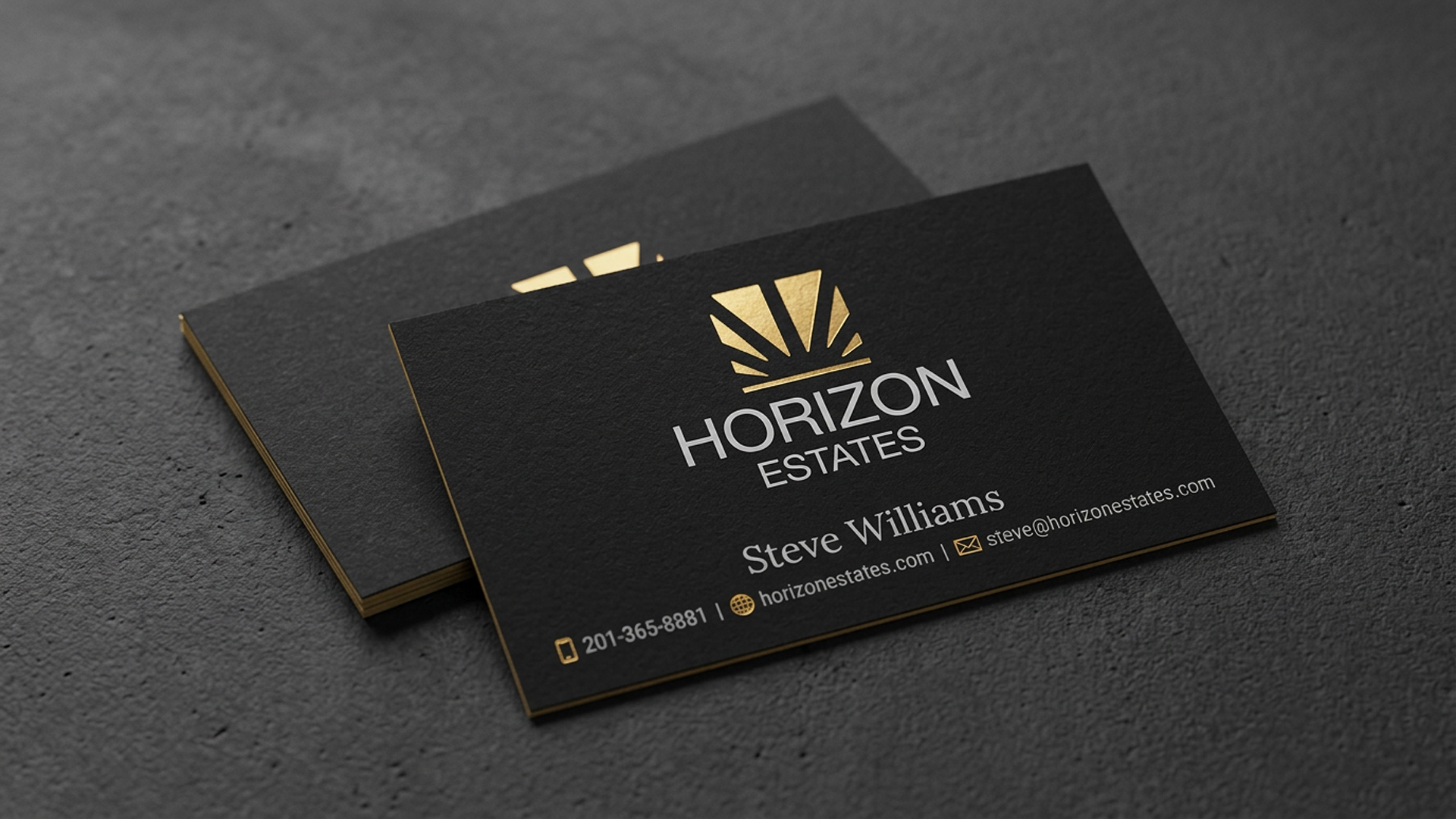
SOCIAL MEDIA GRAPHICS
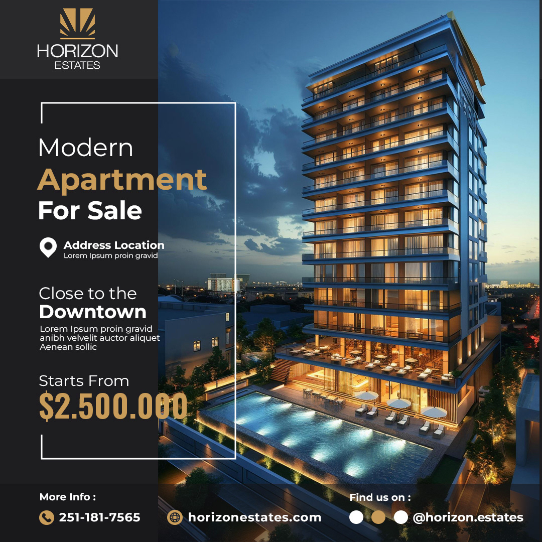
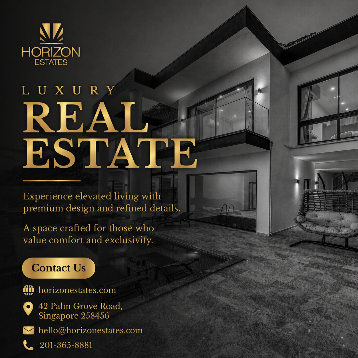

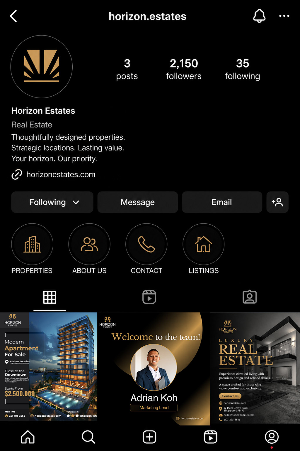
SOCIAL MEDIA MOCKUPS
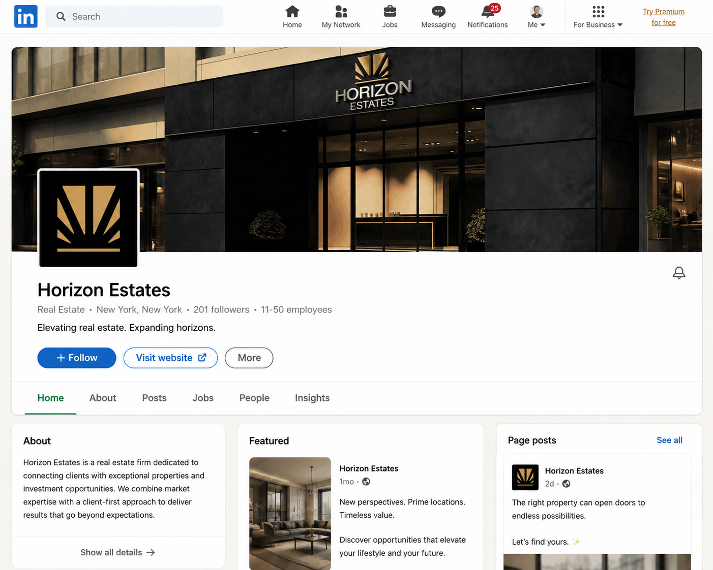
BRAND GRID
Every property is more than an address.
It's a new beginning.
A new opportunity.
A new chapter.
A new opportunity.
A new chapter.
Horizon Estates exists to help people find what's next.